Data visualisation allows you to condense complex and detailed data into something more simple, digestible and, when possible, beautiful.
But analysing huge data sets and turning them into something creative yet newsworthy can be a struggle and sometimes you need a little inspiration. That’s why I’m going to share with you five examples of good data visualisations to give you a clearer picture of what works.
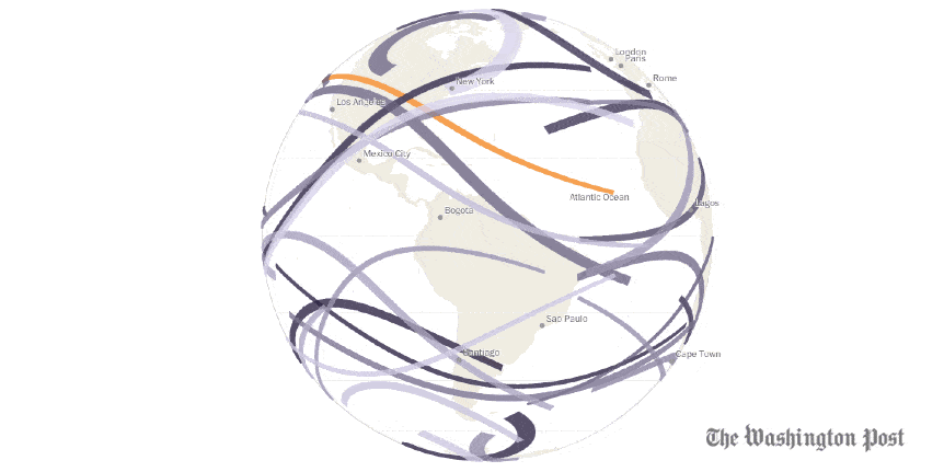
1. Every Upcoming Solar Eclipse Until 2080
The Washington Post is notoriously good at data visualisation. By combining strong and relevant data and with interactive graphics, they are able to create hard-hitting, topical and interesting news stories. This particular piece was created after the August 2017 solar eclipse, which travelled from coast to coast across the US. The interactive spinning globe visualisation shows the eclipse’s path as well as all future eclipse paths until 2080. You can type in your date of birth and the graphic will show you the number of solar eclipses you are expected to see during your lifetime - pretty cool, right?
2. 8000 of Picasso’s Works
National Geographic is another publication that creates exciting and innovative graphics. The ‘8000 of Picasso's Works’ piece grouped the artist’s work into 12 themes and was further divided into artistic subcategories, some of which include the titles of individual works. The size of each category is reflective of the number of artworks Picasso has produced within that given theme.
 Source
3. Terror Attack Deaths, Europe vs Africa (2017)
Simple yet so impactful. Media coverage is sometimes so directed towards your specific country rather than what is happening around the rest of the world. The terror attacks across Europe were not only publicised in British media but across the national and international press. However, we hear much less about the goings-on in other continents, such as Africa. This is a great data visualisation example, taking one hard-hitting metric and visualising it in a way that everyone can understand and be impacted by.
 Source
4. After Babylon
This particular example looked at the structural properties of language around the world. Puff Puff Project created a collection of interactive maps and charts using the World Atlas of Language Structures at the DensityDesign course 2013-14 . The maps and charts show all 2,678 languages around the world, where they are spoken, the population of speakers, the relationship between them and where they originate from. What’s good about this content is that it contextualises information that you never could have interpreted - due to the sheer amount of languages - into a digestible and easily readable format that everyone can understand.
 Source
5. The Language of Congress
Now, The Pudding is the big boy when it comes to data viz - they create super detailed and unique content like you’ve never seen before. This piece was really interesting, not only for the actual content but because of the number of different designs and amount of interactivity within the piece itself. They took Tweets from Congress and analysed them, creating a huge content piece that showed you the topics they were Tweeting about, which individual members of Congress were Tweeting the most about a certain topic, which party overall, which state, example tweets…you get the picture, it is a big content piece.


Some takeaways
- Keep it simple: Data visualisation doesn’t need to be super complicated or detailed in order to work. Being able to take just one metric from a huge data set and visualise it in a way that is digestible to a wide audience is a real skill.
- Keep it interesting: Interactivity works really well for large data sets or if you are trying to show lots of different things.
- Keep it colourful: Colour is also a great way of making your data tell a story, so use it.
Some useful links
If you’re interested in finding out how you can use data visualisation in your own link building campaigns, our digital PR consultant Aliyah Loughlan has got you covered, with her recent blog on how to visualise data for a digital PR.
Some sites you can take inspiration from for good data visualisation examples include Data is Beautiful on Reddit and Information Is Beautiful. If you’re curious about how not to do data visualisation, try Data is Ugly on Reddit and Viz.Wtf.